A design foundation for Mathletics
Tokens, reusable components and accessibility guidance for a more consistent platform.
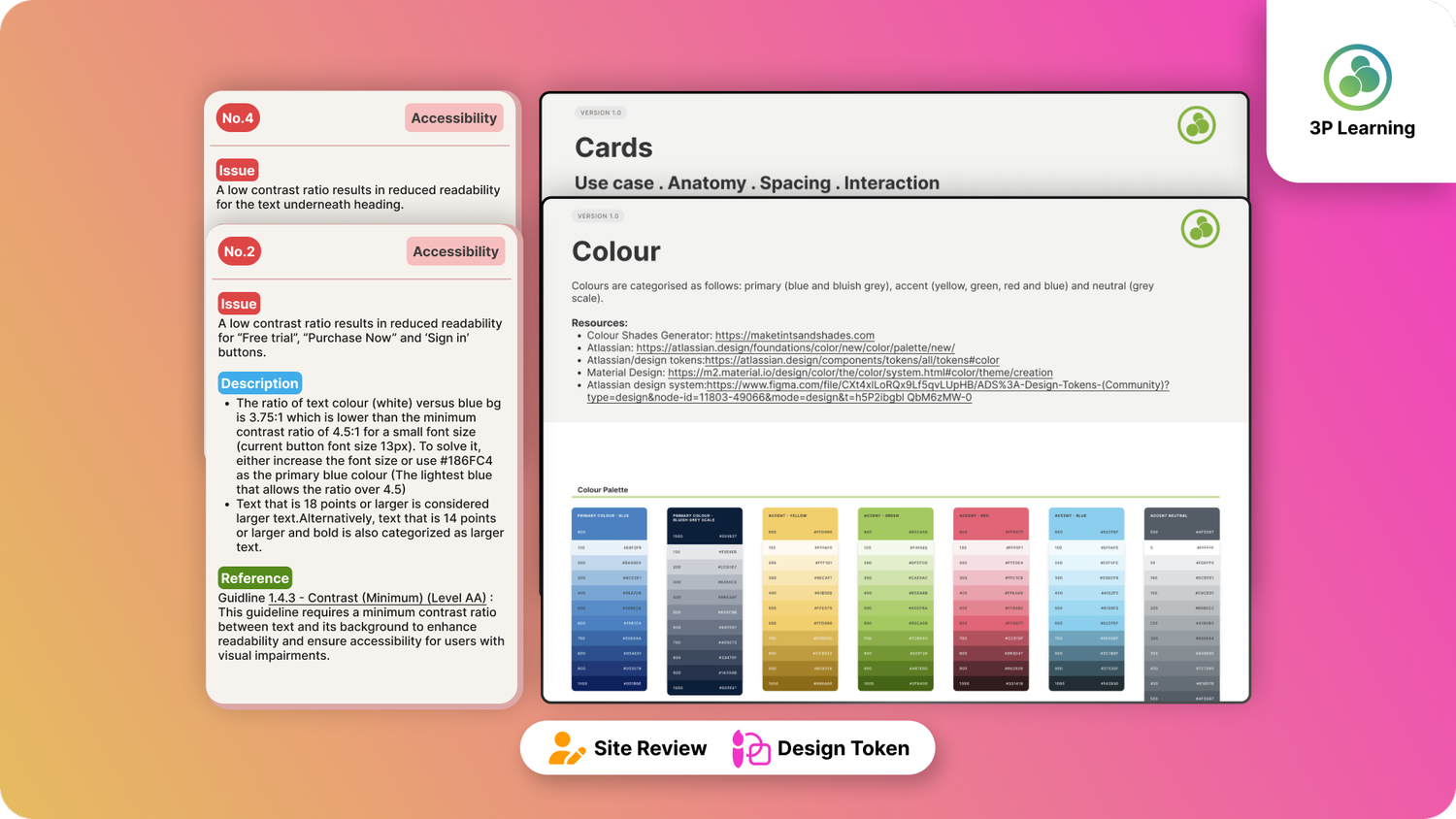
The challenge
Inconsistent spacing, typography and interface patterns made the experience harder to maintain and scale. Contrast and readability also needed attention.
The approach
I audited the interface, defined colour, typography, spacing and radius tokens, and established reusable cards, buttons, tabs and icons. Semantic colour tokens supported light and dark themes. A WCAG 2.1 review documented accessibility issues and recommendations.
The outcome
The work established a clearer foundation for designers and developers. The full redesign was not rolled out; the deliverable was a structured system and recommendations to support future improvements.
Inside the project
ARTEFACTS & WALKTHROUGHSVideo unavailable. View the case study ↗
Video unavailable. View the case study ↗
Video unavailable. View the case study ↗
Video unavailable. View the case study ↗